---
title: Artwork Requirements
description: Our artwork requirements that are applicable to all Channels.
---
[Skip to content](https://help.filmhub.com/en/articles/2663773-artwork-requirements#main-content)
English
Show submenu for translations
![Filmhub\_Logotype\_Neg.png\]](https://help.filmhub.com/hs-fs/hubfs/Filmhub_Logotype_Neg.png?height=25&name=Filmhub_Logotype_Neg.png)
Open main navigation
Close main navigation
- English
Show submenu for translations
- Login/Get Started
Login/Get Started
How can we help?
- There are no suggestions because the search field is empty.
1. [Help Center](https://help.filmhub.com/?hsLang=en)
2. [Guides & Resources](https://help.filmhub.com/guides-resources?hsLang=en)
3. [Submitting Your Title](https://help.filmhub.com/guides-resources?hsLang=en#submitting-your-title)
# Artwork Requirements
## Your artwork is one of the first things viewers see on platforms and one of the first things buyers consider for licensing decisions, making it one of the most important assets for your title. This guide explains how to prepare artwork that meets Filmhub's Quality Control (QC) requirements and maximizes your distribution opportunities.
#### In this guide
- [Required image sizes](https://help.filmhub.com/en/articles/2663773-artwork-requirements#required-image-sizes)
- [Image design requirements](https://help.filmhub.com/en/articles/2663773-artwork-requirements#image-design-requirements)
- [System QC checks](https://help.filmhub.com/en/articles/2663773-artwork-requirements#system-qc-checks)
- Recommended reading: [Artwork - Best Practices](https://help.filmhub.com/en/articles/6506757-artwork?hsLang=en)
---
### Required image sizes
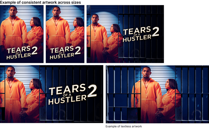
Filmhub accepts artwork in multiple aspect ratios to meet the display requirements of our channel partners. Some artwork is **required** before you can submit your title, while other image types are optional but strongly recommended because they unlock additional distribution opportunities.
#### Movies
| Aspect Ratio | Minimum Size | Required? | Include Title Name? |
| --- | --- | --- | --- |
| Portrait 2:3 | 1400 × 2100 px | **Yes** | Yes |
| Portrait 3:4 | 1575 × 2100 px | **Yes** | Yes |
| Landscape 16:9 | 1920 × 1080 px | **Yes** | Yes |
| Landscape 16:9 Title Treatment | 4320 x 2430 px | Recommended | Yes |
| Square 1:1 | 600 x 600 px | Recommended | Yes |
| Portrait 7:10 | 900 x 1286 px | Recommended | Yes |
| Landscape 4:3 | 1920 × 1440 px | Recommended | Yes |
| Landscape 16:6 | 1920 × 720 px | Recommended | Yes |
| Landscape 2:1 | 1920 × 960 px | Recommended | Yes |
| Landscape 16:9 Textless | 1920 × 1080 px | Recommended | **No** |
#### Shows
| Aspect Ratio | Minimum Size | Required? | Include Title Name? |
| --- | --- | --- | --- |
| Portrait 2:3 | 1400 × 2100 px | **Yes** | Yes |
| Portrait 3:4 | 1575 × 2100 px | **Yes** | Yes |
| Landscape 16:9 | 1920 × 1080 px | **Yes** | Yes |
| Landscape 4:3 | 1920 × 1440 px | **Yes** | Yes |
| Landscape 16:9 Title Treatment | 4320 x 2430 px | Recommended | Yes |
| Square 1:1 | 600 x 600 px | Recommended | Yes |
| Portrait 7:10 | 900 x 1286 px | Recommended | Yes |
| Landscape 16:6 | 1920 × 720 px | Recommended | Yes |
| Landscape 2:1 | 1920 × 960 px | Recommended | Yes |
| Landscape 16:9 Textless | 1920 × 1080 px | Recommended | **No** |
| Season Image (per season) | 1920 × 1080 px | Recommended | **No** |
| Episode Image (per episode) | 1920 × 1080 px | Recommended | **No** |
**What does “recommended” mean?**
You don't need recommended artwork to submit your title, but many platforms require these additional aspect ratios for distribution. If you're missing recommended artwork, QC may ask you to add it before we can deliver your title to certain channels.
**Season and episode images must always be textless.**
**Accepted file formats:** JPEG or PNG only. PSD files are not accepted. PNG-only exception for Title Treatments.
---
### Image design requirements
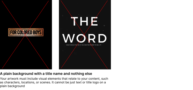
Platforms expect clean, professional key art that clearly represents your title. Your artwork should prominently feature your title name alongside imagery that accurately reflects your film or show.
✅ **DO’S**
1. **Display the title clearly** — All artwork (except textless assets) should display your title name prominently and legibly.
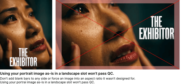
2. **Keep imagery across sizes —** Use the same overall creative direction across every aspect ratio, including imagery, typography, colors, and branding. Design each image intentionally for its dimensions; don't simply crop it from another artwork size.
3. **Title treatment artwork —** The Landscape 16:9 Title Treatment should contain only your title logo or title text on a transparent background. Don't include background imagery. PNG only, transparent background, title text/logo only
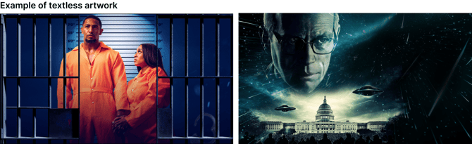
4. **Textless artwork must contain no text —** The following artwork types must not contain any text, including the title name:
1. Landscape 16:9 Textless
2. Season Images
3. Episode Images
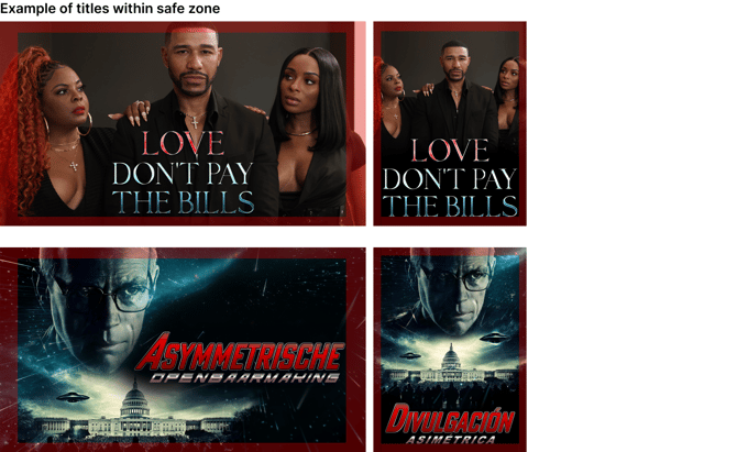
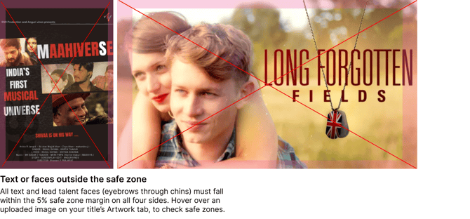
5. **Keep important content inside the safe zone —** Leave a 5% margin on all four sides of every artwork. This helps ensure that devices and platforms don't crop important elements when channels display your artwork across different devices and screen sizes.
1. **Keep these elements inside the safe zone:**
- Title name and any text intended to be read
- Talent faces, specifically eyebrows and chins
- Other key visual elements
2. **Exceptions:**
- Decorative background text
- Text that's part of the original photography or illustration
- Small portions of individual letters, provided the title remains fully legible
- Certain creative compositions or large ensemble artwork, where cropping is intentional
1. 1. **How to check if your artwork is within the safe zone:**
- When you hover over an uploaded image on your title’s Artwork tab, a safe zone overlay will appear so you can verify if the asset meets the requirements.
****
****
****
**🚫 DON’TS**
**The most common reasons artwork fails QC include:**
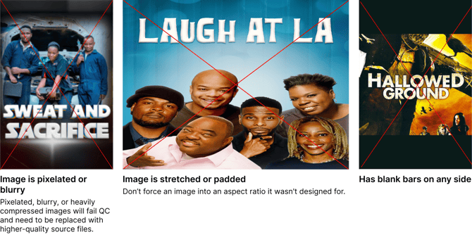
- Using plain production stills instead of key art
- Uploading scanned or photographed DVD covers or VHS sleeves
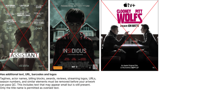
- Using theatrical or festival posters that contain laurels, cast, or credit blocks
- Using one-sheets or pitch materials instead of artwork
- Omitting the title name (except for textless assets)
- Making the title name too small to read at thumbnail size To test this:
- View your artwork at approximately 10 to 15% zoom in an image editor, or
- Resize a copy of your artwork to around 200 to 300 px tall and confirm the title is still easy to read.
If the title becomes difficult to identify, increase the text size, improve contrast, or adjust the artwork layout.
- Uploading blurry, pixelated, or low-resolution artwork
- Reusing the exact same crop across every aspect ratio instead of creating optimized versions
### System QC Checks
When you upload artwork, the Dashboard automatically checks it for common QC issues within seconds, before you submit your title and before a QC technician reviews it. This gives you the opportunity to resolve issues early and helps your title move through QC more quickly.
Our system will indicate if your artwork may fail for one of the following instances:
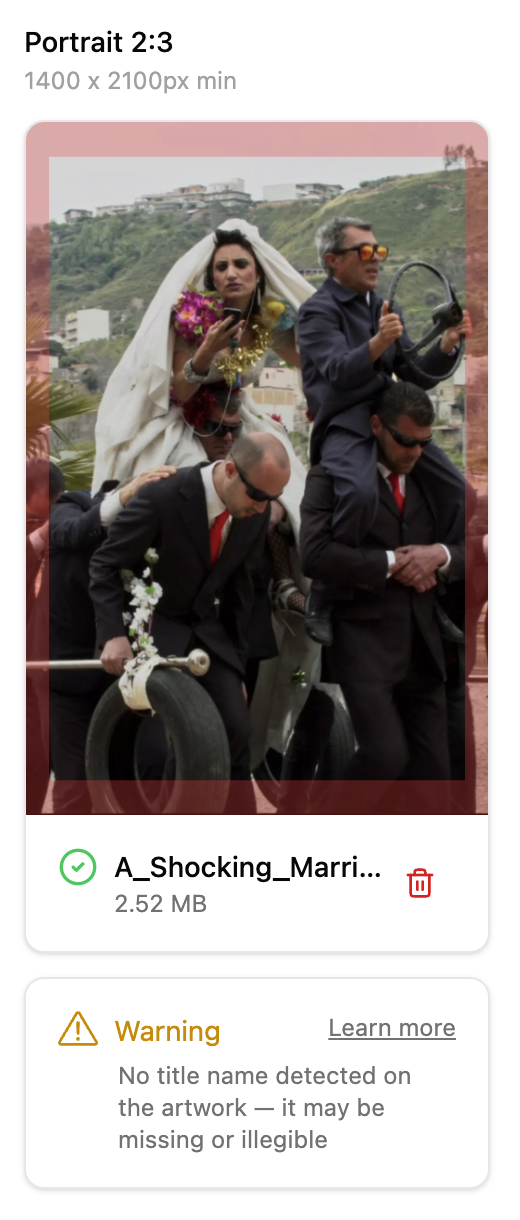
1. **Name not provided or illegible:** The title isn't legible due to font choices, contrast, or sizing.
2. **Name not verbatim:** The title name in your artwork doesn't exactly match your title's name, including any sub-text.
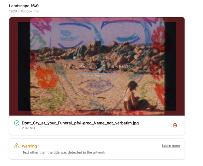
3. **Contains additional text element:** The artwork includes additional text elements, like subtext, credit blocks, laurels, or cast credits.
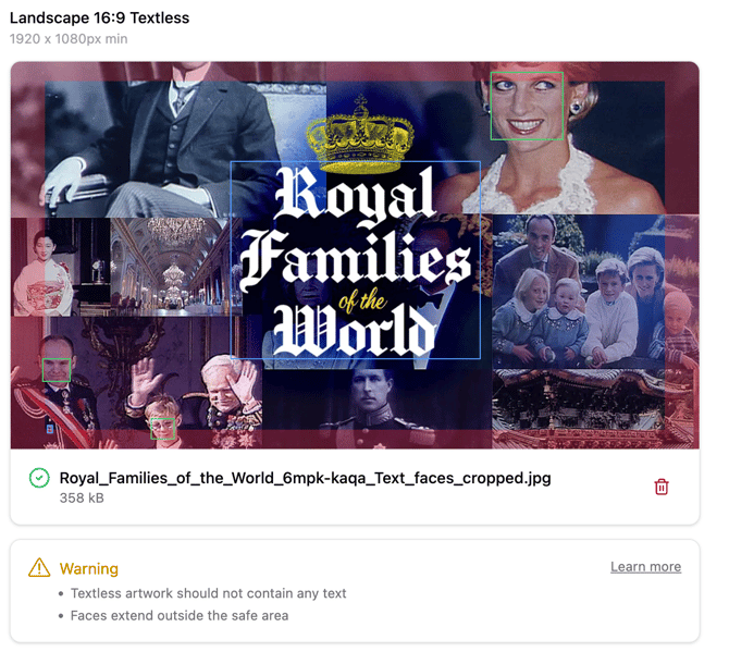
4. **Textless artwork has text:** The textless artwork you uploaded shows visible text.
5. **Text outside safe area:** Text in your artwork falls outside the safe zone and may get cropped on certain devices or platforms. Keep your title name and any other text you want viewers to read within the 5% margin on all sides.
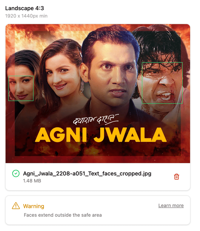
6. **Faces cropped / outside safe zone:** The faces in the artwork fall out of the safe zone and appear cropped. (This may be acceptable if the composition is intentional; a QC technician reviews these cases.)
7. **Title Treatment not a transparent PNG:** Your Landscape 16:9 Title Treatment isn't a PNG file with a transparent background. (Unlike the warnings above, this check blocks the upload. Re-export your title logo or text as a PNG with the background removed, then upload it again.)
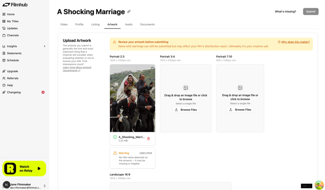
These warnings (except #7) don't prevent you from submitting your title. Your artwork will still receive a full QC review. However, resolving warnings before submission gives your title the best chance of passing QC on the first review.
Please see the following examples of how our system may flag your work:
**Name Not Provided or Illegible**
**Name not verbatim**
**.png?width=670&height=527&name=image%20(22).png)**
**Contains Additional Text Element**
**Textless Artwork Has Text**
**Text outside safe area**
**.png?width=670&height=1217&name=image%20(23).png)**
**Faces Cropped / Outside Safe Zone**
- [Filmhub Overview](https://help.filmhub.com/filmhub-overview?hsLang=en#main-content)
- [Start Your Filmhub Journey](https://help.filmhub.com/filmhub-overview?hsLang=en#start-your-filmhub-journey)
- [Understand Our Services](https://help.filmhub.com/filmhub-overview?hsLang=en#understand-our-services)
- [Filmhub Dashboard](https://help.filmhub.com/filmhub-dashboard?hsLang=en#main-content)
- [Dashboard Pages](https://help.filmhub.com/filmhub-dashboard?hsLang=en#dashboard-pages)
- [Title Submission Steps](https://help.filmhub.com/filmhub-dashboard?hsLang=en#title-submission-steps)
- [Features & Tools](https://help.filmhub.com/filmhub-dashboard?hsLang=en#features-tools)
- [Filmhub's Distribution Strategies](https://help.filmhub.com/filmhubs-distribution-strategies?hsLang=en)
- [Guides & Resources](https://help.filmhub.com/guides-resources?hsLang=en#main-content)
- [Submitting Your Title](https://help.filmhub.com/guides-resources?hsLang=en#submitting-your-title)
- [Filmhub Requirements and Fixes](https://help.filmhub.com/guides-resources?hsLang=en#filmhub-requirements-and-fixes)
- [Best Practices](https://help.filmhub.com/guides-resources?hsLang=en#best-practices)
- [Catalog Import Program](https://help.filmhub.com/guides-resources?hsLang=en#catalog-import-program)
- [FAQs](https://help.filmhub.com/guides-resources?hsLang=en#faqs)
- [Our Recent Subscription Changes: FAQs](https://help.filmhub.com/guides-resources?hsLang=en#our-recent-subscription-changes-faqs)
- [Resources for Rights Holder](https://help.filmhub.com/resources-for-rights-holder?hsLang=en#main-content)
- [Marketing](https://help.filmhub.com/resources-for-rights-holder?hsLang=en#marketing)
- [Resources for Channels](https://help.filmhub.com/resources-for-channels?hsLang=en#main-content)
- [Getting Started](https://help.filmhub.com/resources-for-channels?hsLang=en#getting-started)
- [Finding and Licensing Titles](https://help.filmhub.com/resources-for-channels?hsLang=en#finding-and-licensing-titles)
- [Delivery](https://help.filmhub.com/resources-for-channels?hsLang=en#delivery)
- [Account Management](https://help.filmhub.com/resources-for-channels?hsLang=en#account-management)
- [Legal](https://help.filmhub.com/legal?hsLang=en)
[](http://filmhub.com)
Copyright © 2026, Filmhub